
It has been a year since Loupedeck first announced support for Premiere Pro and After Effects with their Loupedeck+ hardware interface panel, originally designed for Lightroom users. I had seen it online prior to that, and had wished that they had something like that for Premiere, so I was pleased to see that announcement, and eager to try it out. It was a bit challenging to get it installed at first, as I was still on Windows 7, in Premiere 12, but I eventually got it working, and posted my initial impressions of using it here.
 I then took it to Nashville where I spent three months working on editorial for a major feature film. The assistant editor ordered a Loupedeck+ as well, as soon as he heard I had one. But to our surprise, both of the panels sat idle for most of the duration of that project, even though we were using Premiere Pro for 12-16 hours a day. There are a few reasons for that, at least from my perspective:
1: Using Premiere Pro 12 involved a delay in response that has been solved in Premiere 13, but we were stuck in version 12 for larger reasons. The delay made the controls, especially the dials, much less interactive.
2: Even in Premiere 13, every time you rotate the dials, it sends a series of individual commands to Premiere, that fills up your actions history with one or two adjustments. Now pressing a dial resets its value to the default, which alleviates the need to undo that adjustment, but what about the other edit I just made before that? Long gone by that point. So if you are just color correcting, this limitation isn’t an issue, but if you are alternating between making color adjustments and other fixes as you work through a sequence, this is a potential problem. The way to solve this would be to limit each adjustment to be seen as a single action, until another value is adjusted, or a second or two go by, similar in principle to linear keyframe thinning when you use sliders to make audio level adjustments.
3: Lastly, there was the issue of knowing what each button and dial would do, since there are a lot of them (40 buttons and 14 dials), and they are only marked for their functionality in Lightroom. I also couldn’t figure out how to map it to the functions I wanted to use the most. (The intrinsic motion effect values.)
The first issue will solve itself as I phase out Premiere 12 once this project is complete. The second could be resolved by some programming work by Loupedeck or Adobe, depending on where the limitations lie. And adding direct access to more functions in the Loupedeck utility would make it more useful to my workflows, specifically the access to the motion effect values. But all of that hinges on me being able to remember the functions associated with each control, and them being more efficient than doing it with my mouse and keyboard.
 The Loupedeck has led to a number of interesting debates about the utility of a dedicated interface for editing compared to a mouse and/or keyboard. I think this is a very interesting topic, as the interface between the system and the user is the heart of what we do. The monitor(s) and speakers are the flip side of that interface, completing the feedback loop. While I have little opinion on speakers as most of my work is visual, I have always been very into having the “best” monitor solutions, and figuring out what exactly best means. It used to mean two 24″ WUXGA panels, and then it meant a 30″ LCD. Then I discovered that two 30’s was too much for me to use effectively. Similarly 4K was too many pixels for a 27″ screen in Windows 7. Ultrawide 34″ 3440×1440 is my current favorite, although my 32″ 8K display is starting to grow on me, now that Windows 10 can usually scale content on it smoothly. Our monitor is how our computer communicates to us, and the mouse and keyboard are how we communicate with it. The QWERTY keyboard is a relic from the typewriter era, designed to be inefficient, to prevent jamming the keys. Other arrangements have been introduced, but have not gained widespread popularity. The mouse is a much more flexible, analog input device, for more nuanced feedback. (Keys are only on or off, no in-between.) But it is not as efficient at discrete tasks as a keyboard shortcut, provided that you can remember it.
 This has led to debates about the best or most efficient way of controlling applications on the system, and editors have some pretty strong opinions on the matter. I am not going to settle it once and for all, but I am going to attempt to step back and look at the bigger picture. Many full time operators who have become accustomed to their applications are very fast using their keyboard shortcuts, and Avid didn’t even support mouse editing on the timeline until a few years ago. This leads many of those operators to think that is the most efficient possible method of operating, dismissing the possibility that their may be better solutions. But I am confident that for someone starting from scratch, they could get at least as efficient, if not more-so, using an interface that was actually designed for that they are doing.
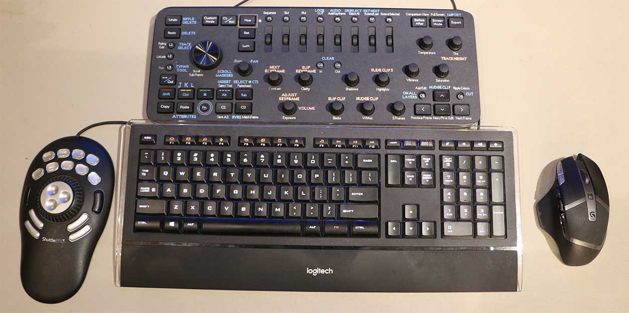
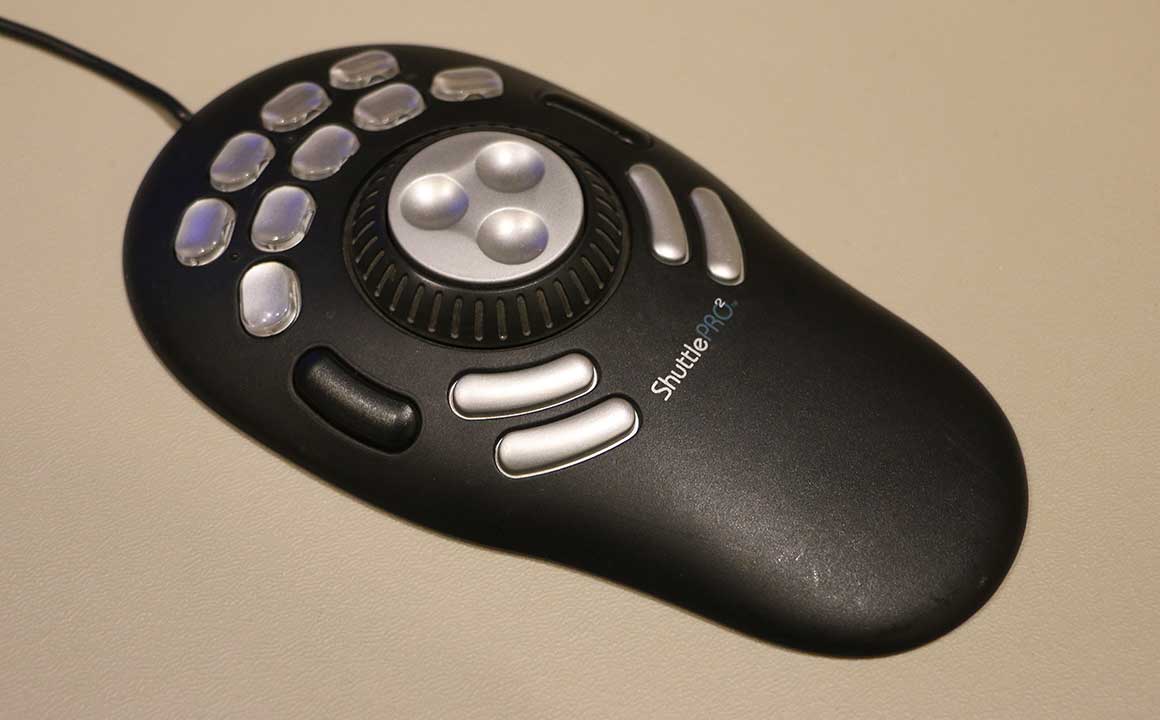 Loupedeck is by no means the first or only option in that regard. I have had a Contour ShuttlePro2 for many years, and have only used it on rare occasions for certain highly repetitive tasks. Blackmagic sells a number of physical interface options for Resolve, including the new editing keyboard, and there have been many others for color correction, which is the focus of the Loupedeck’s design as well. Many people also use tablets or trackballs as a replacement for the mouse, but that usually is more about ergonomics than functionality, and not competing with keyboard functionality. These other dedicated interfaces are designed to replace some of the keyboard and mouse functionality, but none of them totally replace the QWERTY keyboard, as we will still have to be able to type, to name files, insert titles, etc. But that is what a keyboard is designed to do, compared to pressing Space-bar for playback, or CTRL+K to add a layer slice. These functions are tasks that have been assigned to the keyboard for convenience, but they are not intrinsically connected with them.
 There is no denying the keyboard is a fairly flexible digital input tool, consistently available on nearly all systems, and designed to give your fingers lots of easily accessible options. Editors are hardly the only people re-purposing it, or attempting to use it to maximize efficiency in ways it wasn’t originally designed for. Gamers wear out their WASD keys because their functionality has nothing to do with their letter values, and is entirely based on their position on the board. And while other interfaces have been marketed, most gamers are still using a QWERTY keyboard and mouse as their primary physical interface. People are taught the QWERTY keyboard from an early age, to develop unconscious muscle memory, and ideally to allow them to type as they think. Once those unconscious links are developed, it is relatively easy to re-purpose them for other uses. You think “T” and you press it, without thinking about where it is. This is why the keyboard is so efficient as an input device, even outside of the tasks it was originally designed for. But what is preventing people from becoming as efficient with their other physical interfaces? Time with the device, and good design are required. Controls have to be able to be identified by touch, without looking, to make that unconscious link possible, which is the reason for the bumps on your F and J keys. But those mental finger mappings may compete with your QWERTY muscle memory, which you are still going to need to be an effective operator, so certain people may be better off sticking with that.
So if you are super efficient with your keyboard shortcuts, and they do practically everything you need, you are probably not target market for the Loupedeck or other dedicated interfaces. If you aren’t that efficient on your keyboard, or do more analog tasks (color correction) that don’t take place with the discrete steps provided by a keyboard, a dedicated interface may be more attractive to you. Ironically my primary temp color tool on my recent film was Lumetri curves, which aren’t necessarily controlled by the Loupedeck. That was more about contrast because “color” isn’t really my thing, but for someone who uses those tools that the Loupedeck is mapped to, I have no doubt the Loupedeck would be much faster than using mouse and keyboard for those functions. Mapping the dials to the position, scale, and opacity values would improve my workflow, and that currently works great in After Effects, especially in 3D, but not in Premiere Pro (yet?). Other functions like slipping and sliding clips are mapped to the Loupedeck dials, but are not marked, making them very hard to learn. My solution to that, is to label them.
Labeling the Loupedeck
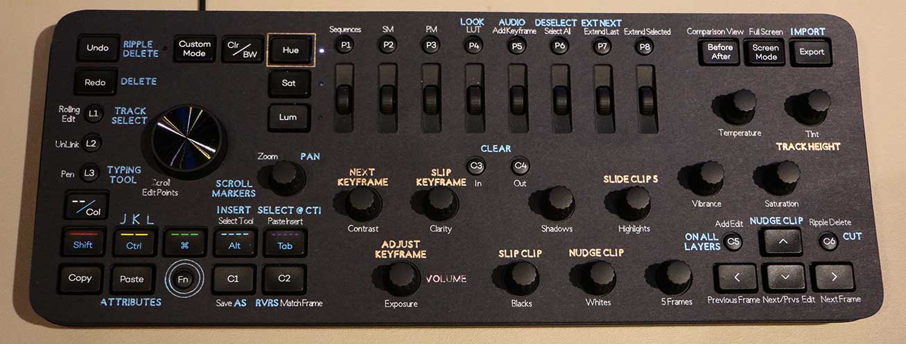 While I like the Loupedeck, the biggest challenge to using it is just keeping track of the huge myriad of various functions available, with four possible tasks assigned to each dial, per application. Obviously it would help if the functions were fairly consistent across applications, but currently by default they are not. There are some simple improvements that can be made, but not all of the same functions are available, even between Premiere and After Effects. So labeling the controls would be helpful, even just in the process of learning them, but they change between apps, so I don’t want to just take a sharpie to the console itself.
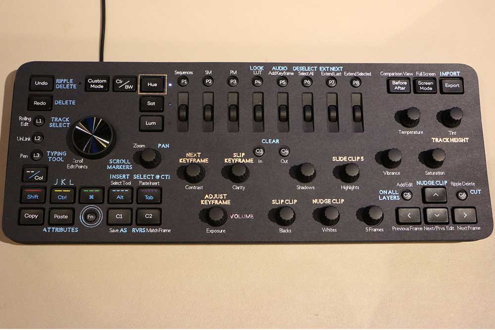
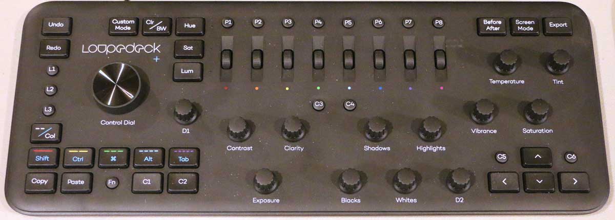
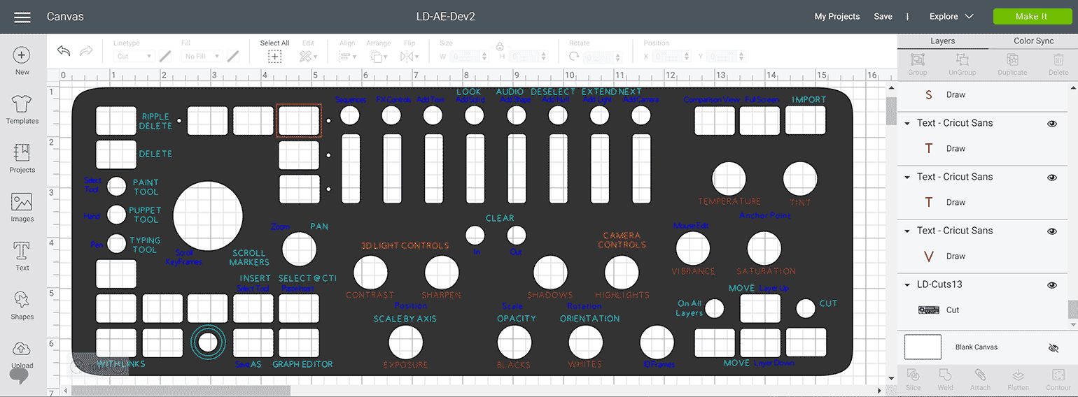
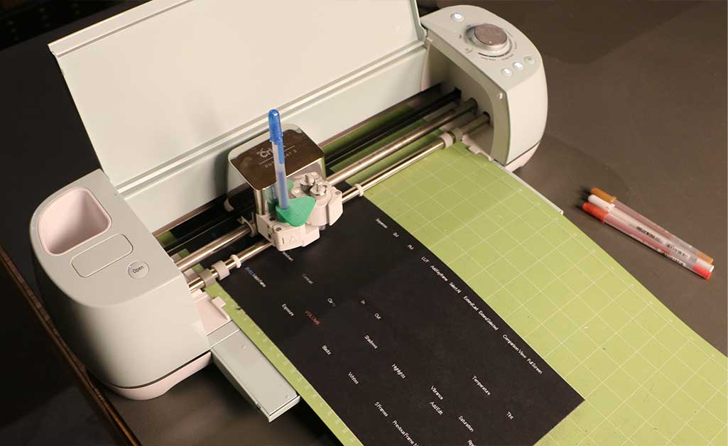
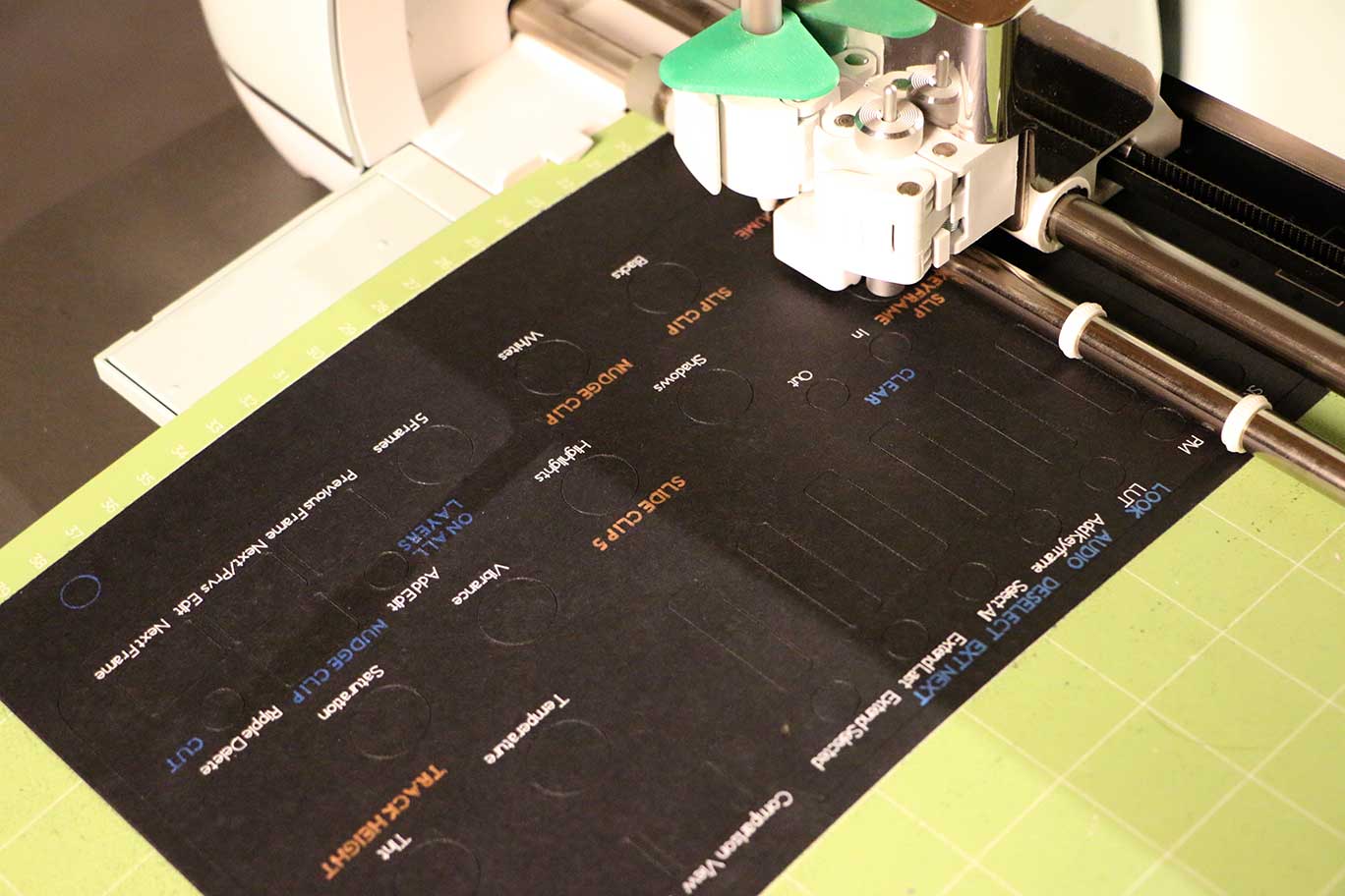
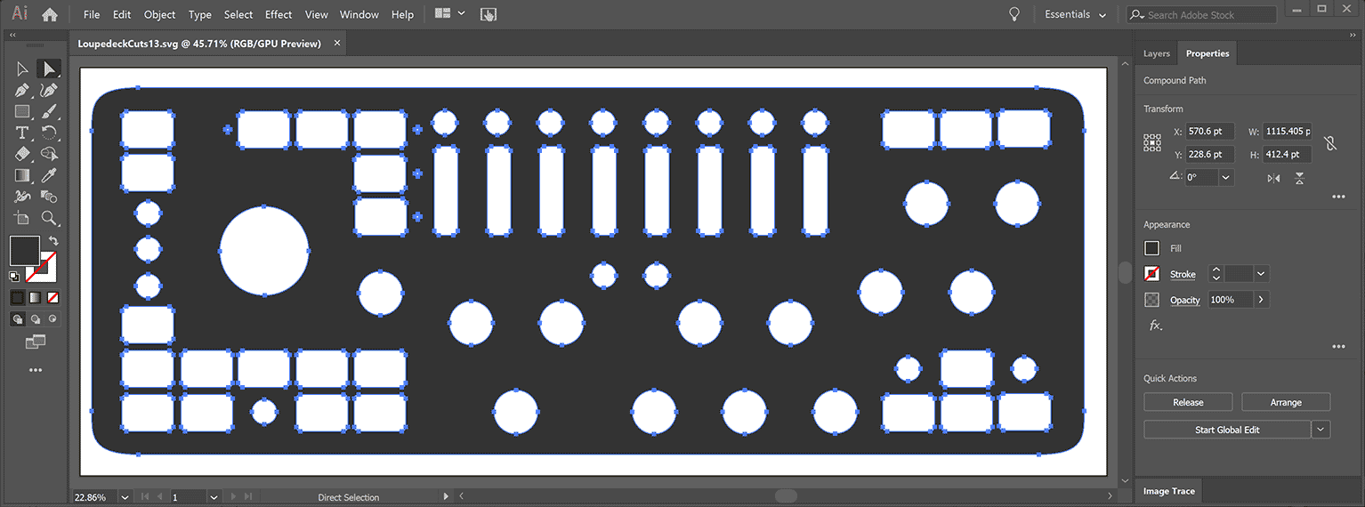 The solution I devised was to make cut outs, that can be dropped over the controls, with the various functions labeled with color coded text. There are 14 Dials, 40 Buttons, and 4 Lights that I had to account for in the cut-out. I started with a photograph of the board next to a tape measure, and a diagram from the manual, and traced a vector based image over that in Adobe Illustrator. I then used a CnC paper cutter, specifically the Cricut Explorer Air 2 to make the cutouts from black card-stock or poster-board. It took a number of tries, with .1% scale adjustments and some shifting of individual boxes before the resulting cutout would fit over the Loupedeck’s controls tightly. I wouldn’t recommend wasting as much time as I did on that process, but I was doing it not just for myself, but for you, my interested readers. This resulting SVG file should be able to be imported into Cricut Designer, Silhouette Studio, or any other CnC application. You’re welcome.
 Labeling turns out to be much more difficult, both because we are trying to write on black, and because Adobe Illustrator has no intrinsic support for Monoline type, which is necessary for labeling with a CnC pen. It may be possible to print blanks before cutting them, but most printers don’t support ink that will be visible on black paper. There are a number of paint and metallic pens that do write on black, that can be put in a CnC machine, but the challenge there is finding ones fine enough to make legible text at the small size we need for the labels. After numerous tests, I settled on Gelly Roll Metallic pens, which required custom 3D printed adapters I found on eBay, to fit into the machine.
 Then there is the matter of creating the label values themselves. In my case I had to use CriCut Design Space to add the labels to the cutout that I had imported from SVG. That has to be one of the most frustrating applications I have ever used, and just like most things I do, I was definitely pushing the envelope of what it seemed capable of, in terms of project complexity. There are about 130 possible operations available on the Loupedeck+, and I was only labeling about half that many, but that is still 65 layers, that I was able to combine down to maybe 40. But by the end every edit was taking a minute or two to process, so I did it while watching a movie, which is not my preferred way to work. But my final designs should be available on Cricut’s server. It may be easier to just make the cutouts from the SVG file, and hand label them with a fine tip metallic pen, if your handwriting is legible, and small enough.
 I did separate label patterns for Premiere and After Effects, and I may do one for Photoshop, but I haven’t gotten to that yet. They are currently based on the Loupedeck’s default settings for those applications, but if I start using it enough, I may make a customized version, and publish both the settings file and the revised labels. That all depends on how useful the console ends up being, now that I can easily remember all of the functions. Only time will tell, and this solution would probably be more effective for some users than others.
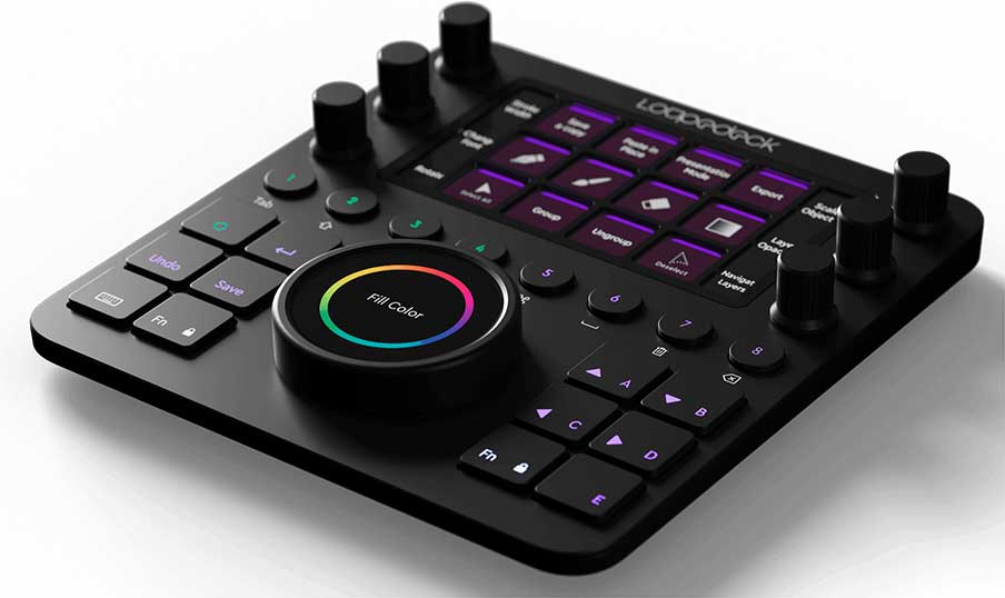 Loupedeck also recently announced the new Loupedeck CT (Creative Tool) which will start shipping next month for $550. At more than twice the price, it is half the size, but it labels the buttons and dials with LCD screens that change to reflect the functions available for whatever application and workspace you might be in. This cutout offers a similar but static capability to the much larger set of controls available on the cheaper Loupedeck+.
I do not think I’ve touched the software sliders in Lightroom Classic on my main editing workstation since the Loupedeck+ was released. One addition is a 3D printed stand to raise the LD slightly and make it easier to sue above the keyboard. I found it at https://www.etsy.com/listing/1136699494/loupedeck-stand?ref=yr_purchases
And yes, I just ordered your overlay.
Thanks for the SVG file! I used a different approach using a colour laser printer and a laser cutter. I imported your SVG file into Illustrator and created registration marks in all 4 corners. I then created a new layer for the coloured text with the same registration marks in the 4 corners. I printed the overlay graphics onto 11×17 cardstock then took it to the laser cutter, aligned the registration marks and cut the holes. The cutouts and graphics lined up perfect. Your SVG file saved me a ton of time creating my own vector artwork for the laser cutter! Now that I have the templates I can create custom overlays very quickly.